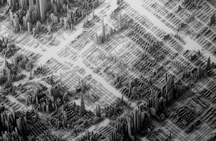
 In one part of Chicago’s Near West Side, the median household income is $104,000. In another—about a mile away—it’s about $20,000. A recent data visualization maps out the city’s stark income inequality in diagrams that look like a skyline: The taller the “building,” the higher the income on that block. “It was really important to me to create the image of a city, and create this kind of post-apocalyptic ambiance,” says Austrian designer Herwig Scherabon, who mapped income in Chicago, L.A., and New York City as part of a larger Atlas of Gentrification. “When you look at it, you start to explore. The street grid is still visible in the visualizations.” Using height to illustrate differences, instead of a standard heat map, makes the problem even more obvious. Chicago wasn’t always so starkly divided: In the 1970s, nearly half of the households in the city were middle class. Over the next four decades, Chicago added almost four times as many wealthy census tracts, while extreme poverty also grew. By 2010, middle-income tracts made up only 16% of the city. Read on >>>
